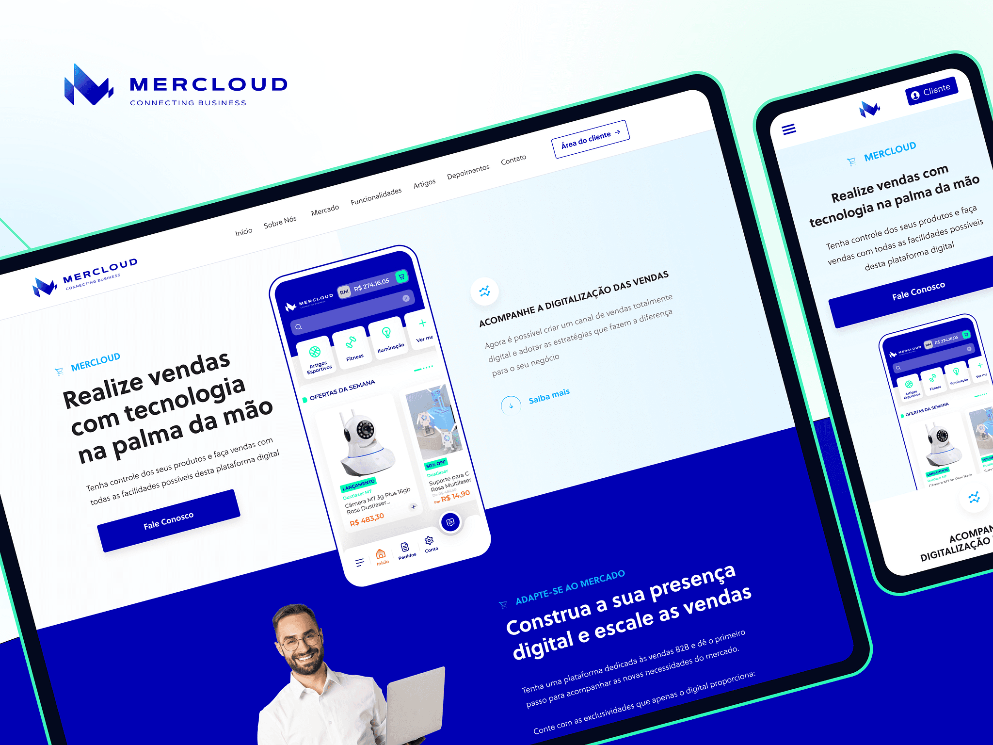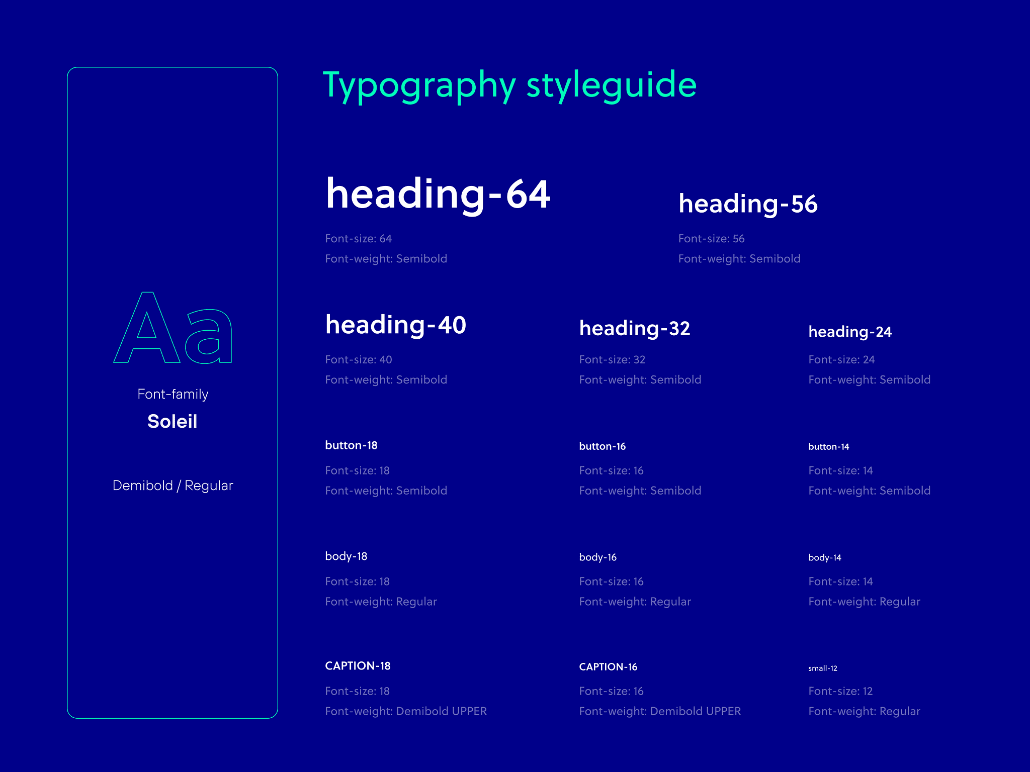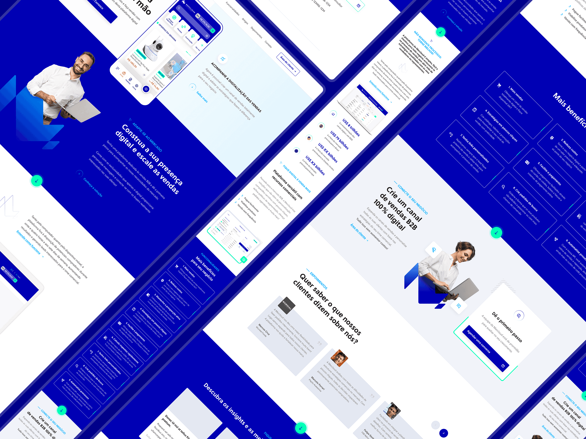
When creating an interface for a Mercloud project, it's important to keep in mind that the visual appearance of the platform can significantly affect the user experience. This means we need to find a balance between the aesthetics of the interface and its functionality.

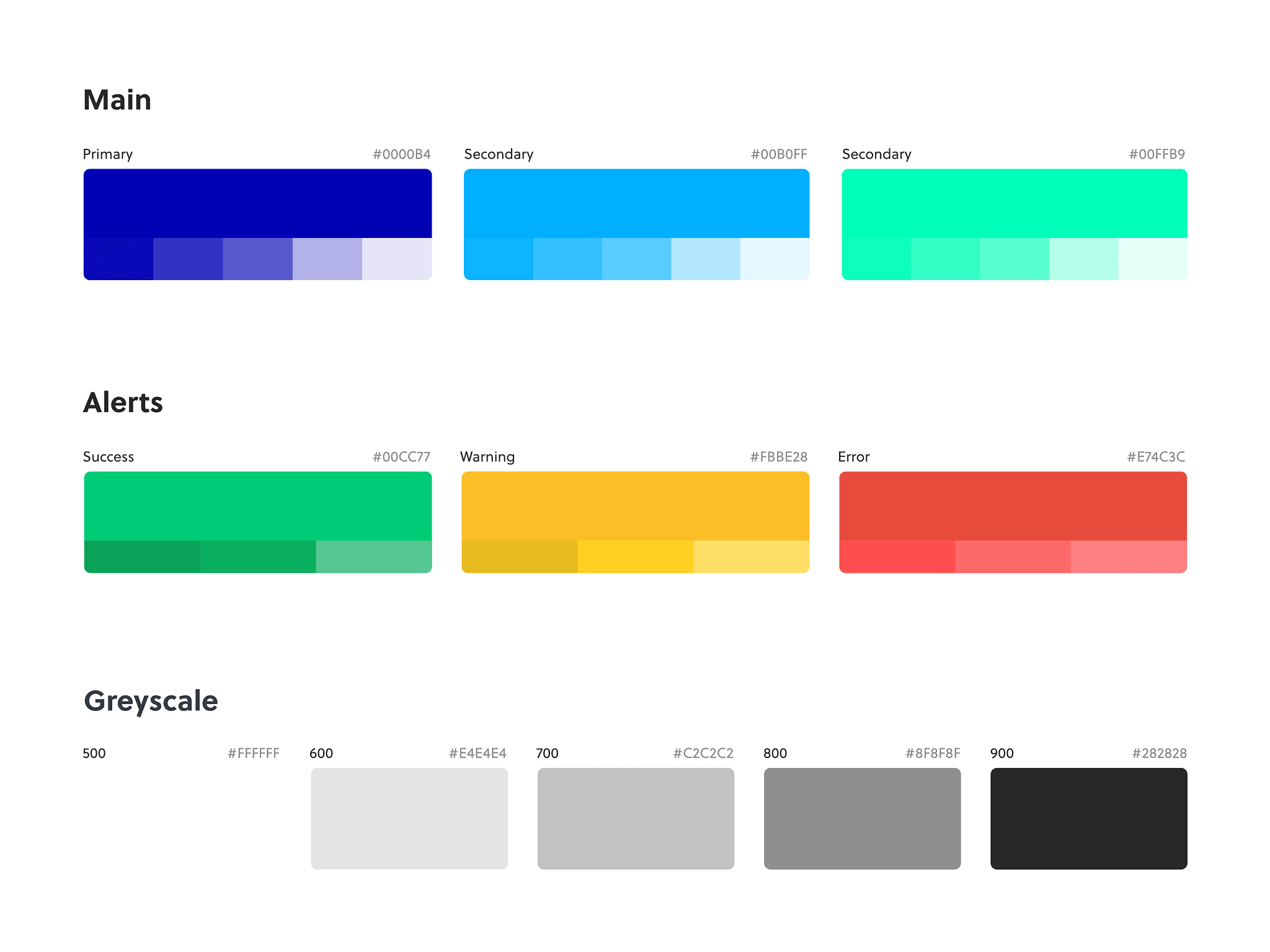
The choice of colors was also a challenge. In the case of Mercloud, the predominant colors are blue and white, with a secondary shock green color. Choosing appropriate shades of blue and green that complement each other can be quite a challenging task. Additionally, it is important to choose colors that reflect the brand's identity and are appealing to the 2B audience.

Another challenge was to ensure that the interface is intuitive and easy to use. This includes making sure that buttons, menus, and other interface elements are easily identifiable and accessible to users. The interface is responsive and works well on different devices and screen sizes.


