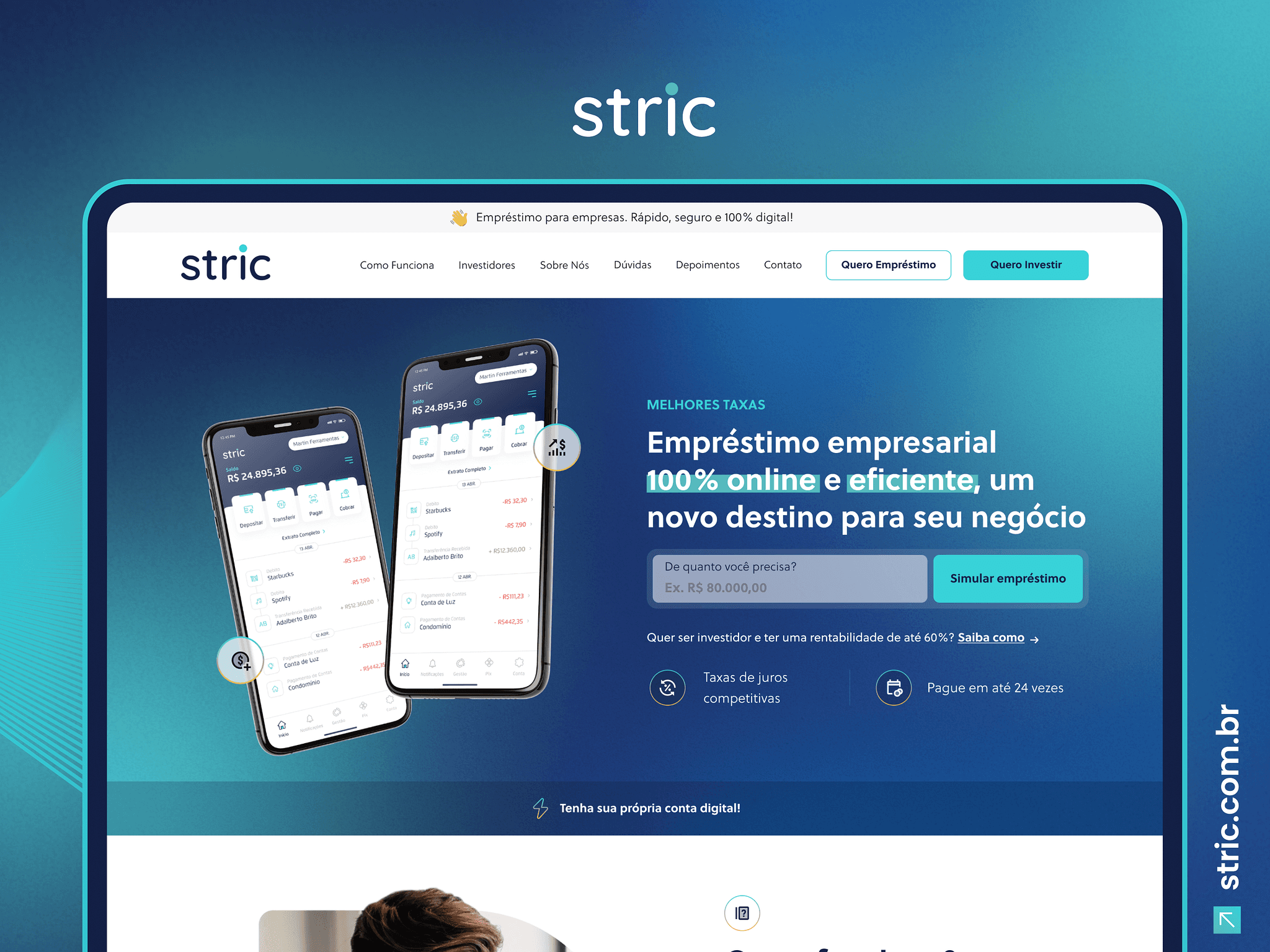
This is the interface we created for Banco Stric. A very challenging project, as we only had a PNG logo to work with, no Brand Book, no artistic direction from the brand creator, so we had to create the composition based on just 2 colors.

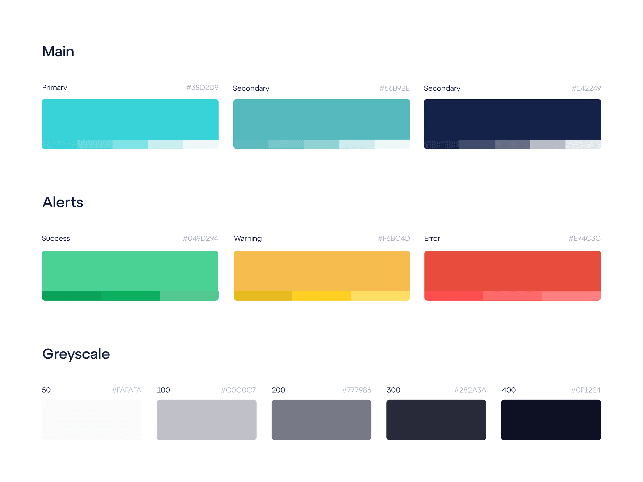
We use 3 shades of blue, each with its own meaning and use in design. For example, dark blue can be used to create a serious, safe, and elegant atmosphere, while lighter shades are more airy and can be used to create a calm and confident environment.

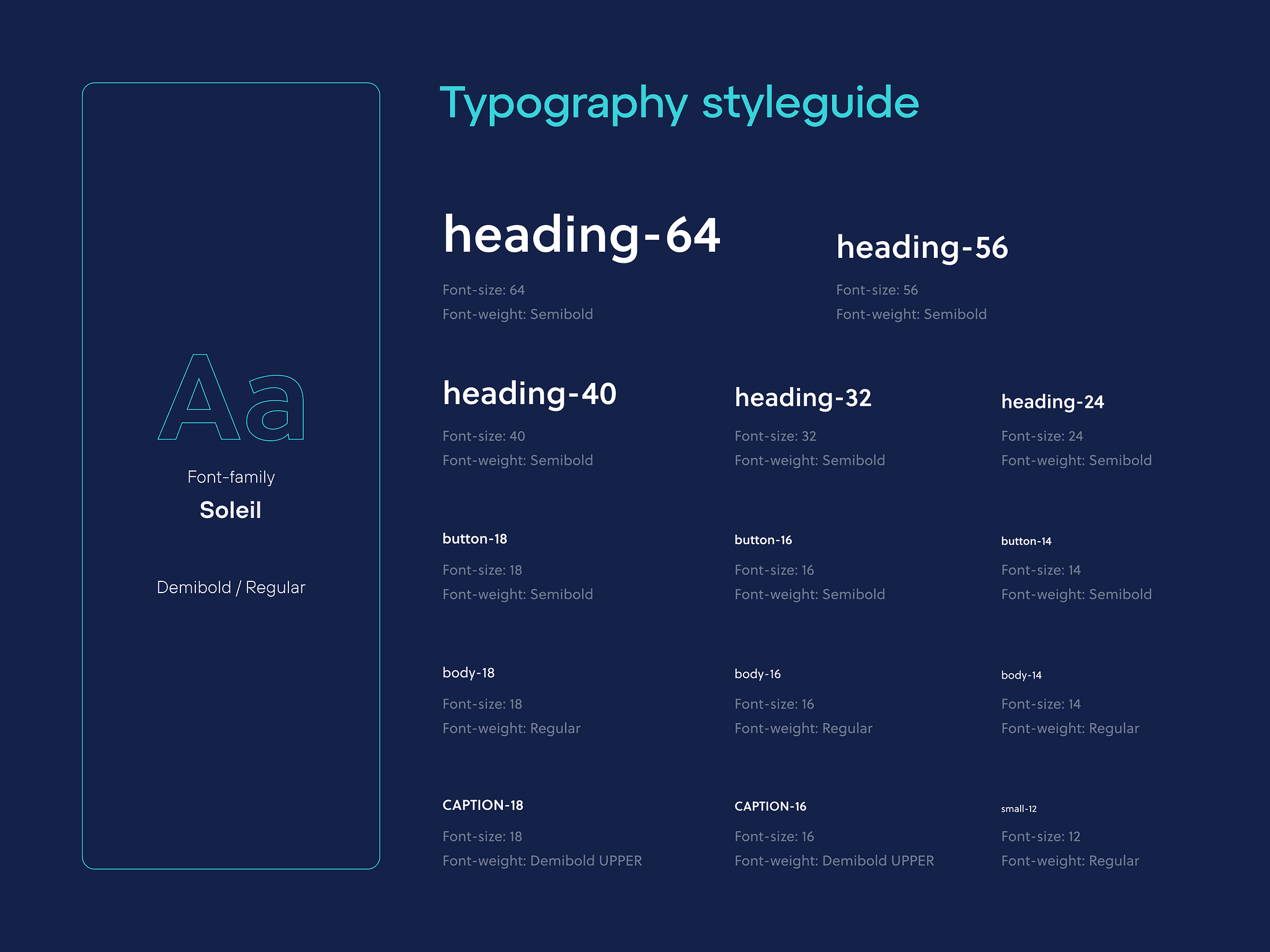
The chosen font was not the brand's, as we needed to convey more seriousness, so we decided to use a bit more straight edges; our choice was Soleil, which can be downloaded from Adobe Fonts.

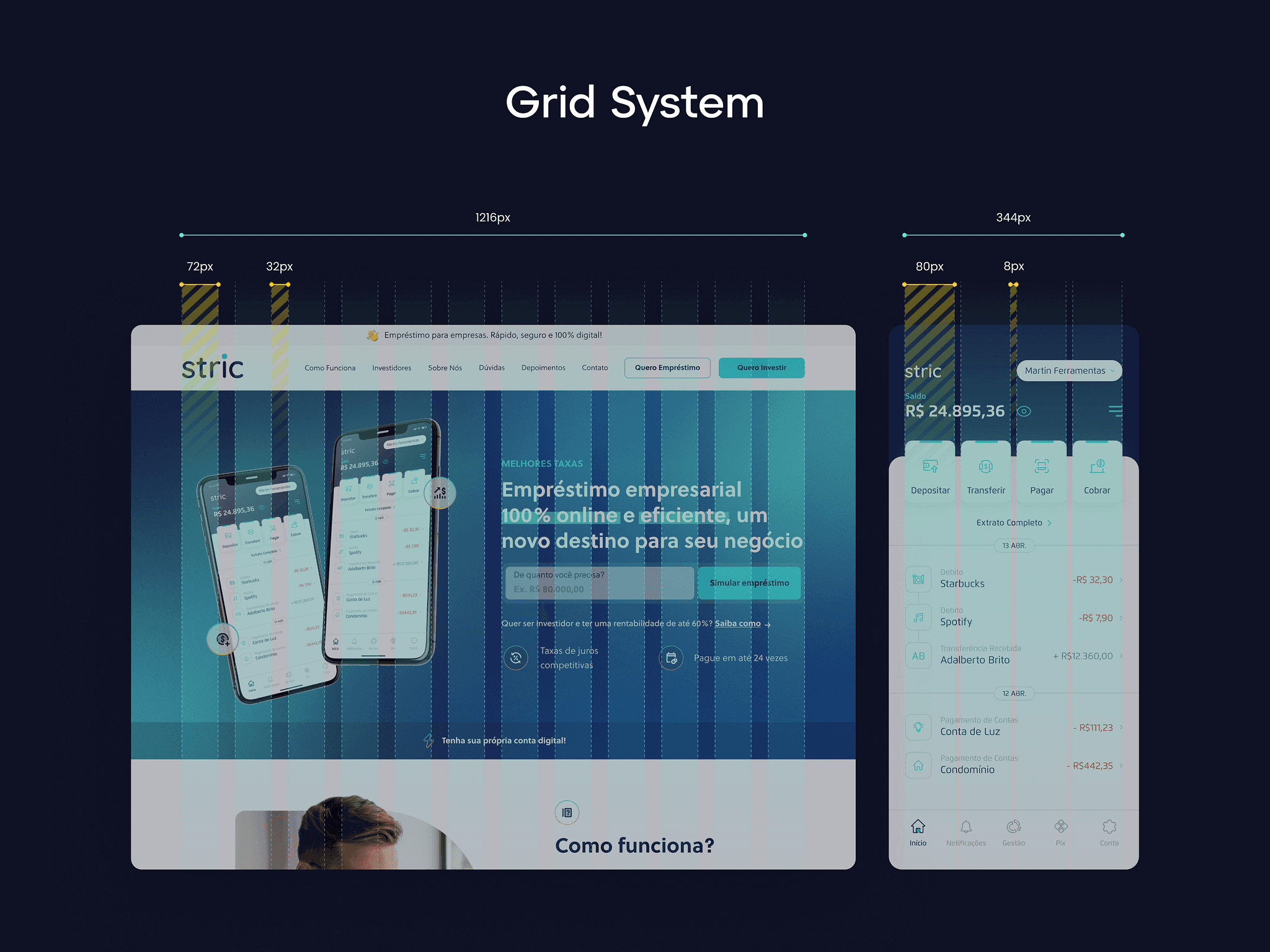
The grids of this project remained in our standard, 72 for columns, 32 for gutter (which is the spacing between the columns) totaling an area of 1216px, ideal for over 95% of monitors.


