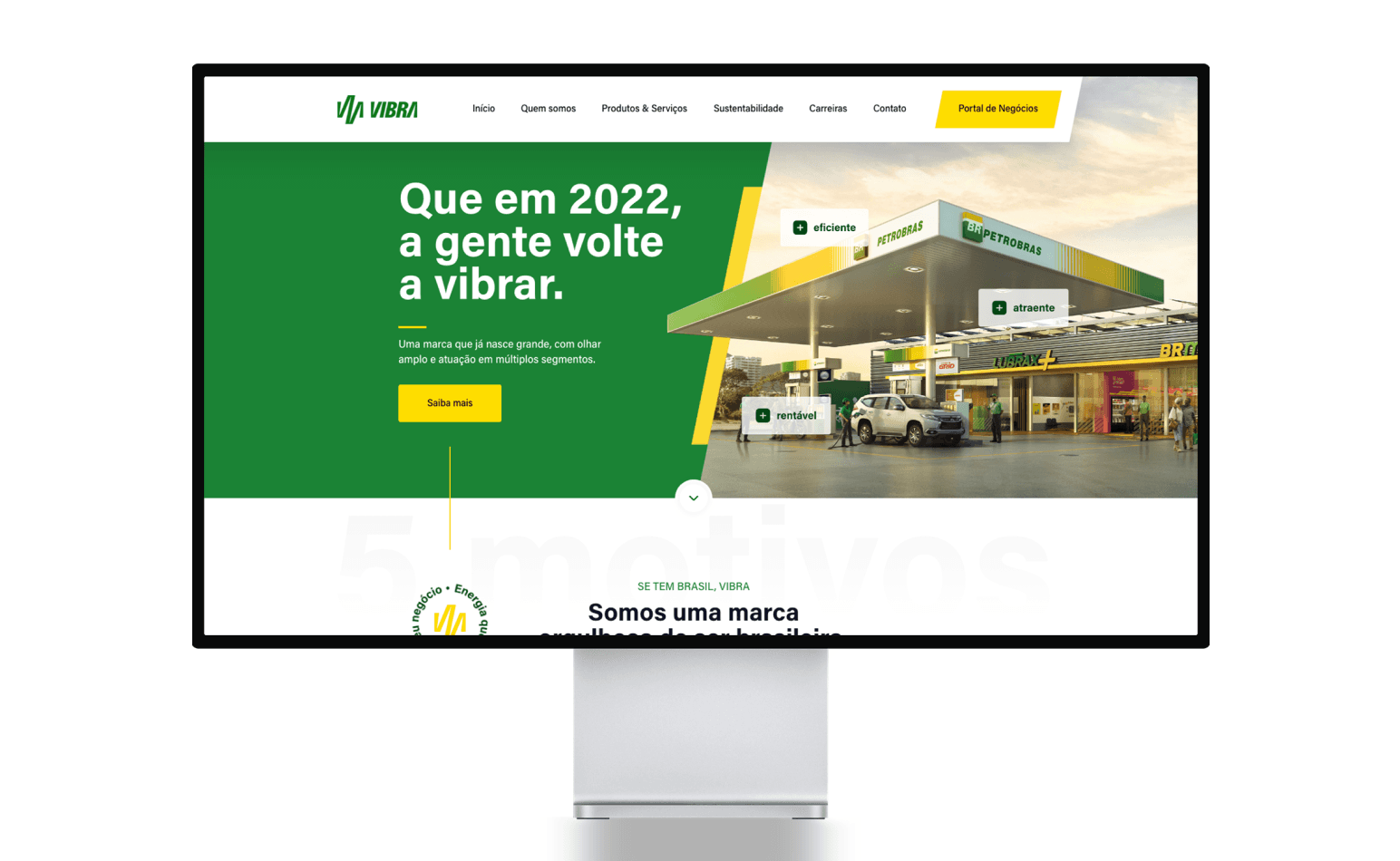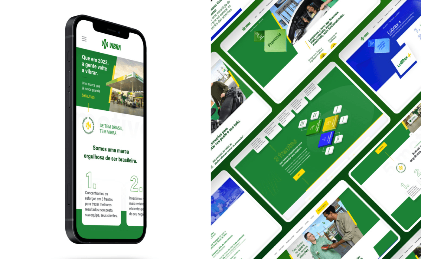
The Vibra website uses an energetic color palette, with green and yellow, conveying vitality and confidence. The bold typography reinforces messages of renewal and efficiency. The layout highlights essential information clearly and directly.

Responsive design provides smooth navigation across all devices while maintaining visual consistency. Strategic buttons like "Learn more" maximize user engagement. The site reflects Vibra's strong identity and facilitates the exploration of its services.


