Published
7 MIN READ
How to Create a Website That Sells: What to Define Before the Layout
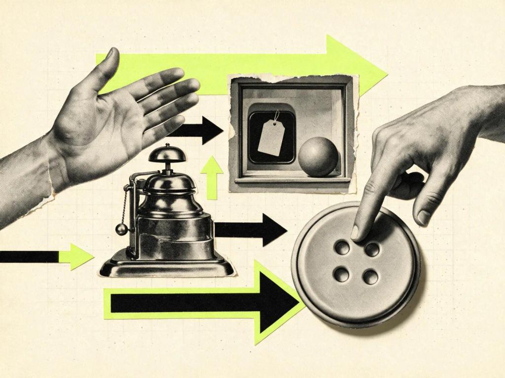

Creating a website that sells starts far from the layout: it starts with deciding what needs to be clear in the first few seconds. What you do, for whom, and what the visitor's next step is. When those three answers show up before any visual choice, the website guides the buying decision instead of just decorating the brand.
At Wama, after more than 200 projects delivered, I've learned that the question of how to create a website that sells is rarely about tools. It's about clarity: mapping the doubts that stall a buying decision and organizing the pages to answer each one in the right order. The visual side comes in to reinforce that reading, not to compete with it.
An important distinction before going on: a website that sells, here, isn't a synonym for an online store. Most guides on the subject teach you how to set up e-commerce. This article is about the professional company website, the one for a service business, a brand or a B2B company, whose job is to turn visits into sales conversations.
A website that sells doesn't start with the layout. It starts with deciding what needs to be clear in the first few seconds.
What does a website that sells need?
A website that sells needs three layers: a clear value proposition above the fold (what the company does, for whom and why it's worth choosing), a page structure that answers buyers' questions and a visible next step at every stage. Design, copy and technology exist to support those three layers, never the other way around.
In practice, this flips the usual project order. Before discussing visual references, Wama writes the above-the-fold sentence with the client, along with the argument the entire website will support. The test is simple: if a stranger reads the homepage for ten seconds and can explain what the company does, the foundation is there. If they can't, no animation will fix it, because visitors don't buy what they didn't understand.
A clear value proposition comes before the layout
This is the least glamorous part of the project and the one that most defines the result. At Wama, the first deliverable for a website is never a screen: it's the sales argument, organized, with the questions the buyer would bring to a meeting and the order in which they need to be answered. I run this process end to end, from the strategy meeting to launch, and that's exactly why it works: nothing gets lost between departments.
It's worth writing these answers down before calling anyone: a completed briefing changes the quality of the proposal you get.
The layout comes in afterward, with a defined role: giving weight to what matters and taking weight off what distracts. That's when design that adds value stops being a nice phrase and becomes a concrete decision about hierarchy, contrast and reading rhythm. And there's a sign of the times here: with AI in development, the technical work of building and publishing has become much faster. What's still expensive and rare is clarity about what the website needs to say.
How do you organize the structure of a website that converts?
The structure of a website that converts follows the order of the buying decision: the homepage summarizes the argument, the inner pages go deeper into each service, social proof shows up near the points of doubt and every page ends with a next step. The menu exists to guide that path, not to list everything the company does.
The process I use at Wama to get to that website structure has five steps:
Map buyers' real questions. Price, timeline, process, what happens after launch. Every question left unanswered on the website becomes an objection in the proposal.
Order the answers by importance. The homepage is the summary of the whole argument: proposition, proof and invitation. A page that tries to say everything says nothing.
Give each core service its own page. One page per offering, with problem, process and proof, explains better and ranks better than a generic list of capabilities.
Put social proof near the doubt, not in the footer. Client logos, testimonials and case studies are worth more next to the promise they back up.
End each page with a single next step. One clear action per page: book a call, request a proposal, see a project. Three different buttons competing with each other add up to none.
Mistakes that keep a professional website from selling
After more than 200 projects at Wama, I notice that the reasons a professional company website doesn't generate leads are almost always the same. And they're rarely technical.
Talking about yourself instead of the client. Generic statements about passion and innovation don't answer any buying question. Visitors want to know what changes in their business.
Treating the homepage as a catalog. When everything carries the same weight, nothing does. Hierarchy means choosing what stays out of the first screen.
Hiding what builds trust. Portfolio, clients served and contact need to be one click away, not buried in the footer or in secondary menus.
Promising immediate results. A company website builds brand perception and value over time. Anyone promising to double sales in the first month is selling something else, and experienced buyers notice.
Ending the project at launch. The website keeps pace with the business: services change, new proof appears, sections stop making sense. And there's a natural limit along the way, the moment when the website needs to become a digital product to handle the operation.
What is the visitor's next step?
The visitor's next step is the single action each page of the website proposes at the end of the reading: book a call, request a proposal, see a project. Websites that convert define that step before the design, write the invitation without pressure and remove any friction from the path, like long forms or hidden contact details.
In high-value services, the natural next step is a conversation, not a buy button. That's why the invitation needs to be understated: people signing a significant contract distrust manufactured urgency. On the websites I deliver through Wama, every page ends with a direct invitation, in one sentence, pointing to contact or to a project that proves that page's argument.
Frequently asked questions
Is a website that sells the same as an online store?
No. An online store sells products with a cart and payment on the website. A company website that sells works before that: it builds trust, explains the service and turns visitors into sales conversations. For anyone selling services, consulting or high-value projects, that's the right model; the deal closes in a meeting.
How long does it take for a new website to deliver results?
It depends on what you call results. Clear communication shows up on day one; brand perception, authority and qualified leads are built over months. A company website is an investment in branding and value over time. Be wary of promises of immediate return: it's a promise no serious website can keep.
How much does a professional company website cost?
In the Brazilian market, prices vary enormously, and they track the depth of the process, not the number of pages. At Wama, I publicly advocate for company websites in the US$ 6,000 to US$ 10,000 range, with strategy, original design and development run by the same person, from start to finish.
Do I need to rebuild my website from scratch for it to sell?
Not always. When the technical foundation is solid, reorganizing the message solves it: rewriting the first screen, reordering sections by the buying decision and defining the next step on each page. Rebuilding from scratch makes sense when the platform is limiting, the design works against readability or the brand has outgrown the website.
Which platform should you use to create a website that sells?
The platform matters less than clarity, but it does matter. At Wama, the core territory is Framer: it lets a single person run design and publishing quickly, without giving up polish. There are already more than 50 projects published on the platform, from landing pages to full company websites. The criterion for any choice is the same: the tool needs to serve the message, never the other way around.
If you've made it this far, you already have the outline of the process: clarity, structure, proof and next step. That's the work I run end to end at Wama, the same process applied to projects for brands like KFC Brasil, Camila Farani, Tera and Wiz Benefícios. See the projects at wama.com.br and decide whether it makes sense for us to talk.